- Log in to CodeSandbox
- Open this link
- Work on the project (remember to save periodically)
- Submit the link
First let's create the navbar.
- Inspect the navbar on Apple homepage and see its height and background color.
- Set our navbar to the same height, color and background color as on Apple homepage.
- Add the links as
<a>(but you don't have to link to actual pages, you can usehref="#"). - Center the texts.
Hint: You can target all the child <a> of <nav> like this:
nav > a {
/* your styles here */
}
The end result should look similar to this:

The header section has a black background color, but before we can set and see it, this section needs a height or content inside. The header and the first 2 cards actually have a fixed height of 736px.
- Set the height of the header to 736px.
- Add the texts
- Add the images (
2.png,4.png,6.png) - Center them horizontally and spread them till they touch the edges vertically.
We can divide the main area into 7 sections, each one is a card.
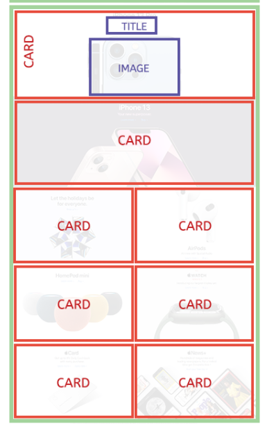
For each card, you can set a fixed height (use the inpector to see how much you should set it to), then set the background image to one of the provided assets. Then it becomes just like the header we did before.
At first, all your cards would take the full width, so there will be 7 rows for 7 cards. However, on the Apple page, we see that only the first 2 cards take a full row each. The rest of the rows have 2 cards each.
The trick is to use flex with flex-direction: column on the <main> or the wrapper of all these cards and for the child cards, we set flex-basis accordingly: 100% (as it takes 100% of the width) for the first 2 cards, and 50% (as it takes 50% of the full width) for the rest (change the height of these cards too, use the inspector to see the exact number). Of course we need to set the wrapper to wrap the elements when there's not enough space with flex-wrap.
You can use flexbox to easily set up the columns in the footer.
That's it! Submit your link when you're done at the next step.