When applying a transition, you have a few decisions to make, each of which is set with a CSS property:
transition-property(required): which CSS property to change.transition-duration(required): how long it should take.transition-timing-function: the manner in which the transition accelerates.transition-delay: whether there should be a pause before it starts.
Transitions require a beginning state and end state. The element at it appears when it first load is the beginning state. The end state needs to be triggered by a state change such as :hover, :focus, or :active. Example:
HTML:
<a href="..." class="smooth">awesomesauce</a>
CSS:
.smooth {
  display: block;
  text-decoration: none;
  text-align: center;
  padding: 1em 2em;
  width: 10em;
  border-radius: 1.5em;
  color: #fff;
  background-color: mediumblue;
  transition-property: background-color;
  transition-duration: 0.3s;
}

.smooth:hover,
.smooth:focus {
  background-color: red;
}
transition-timing-function
Values: ease | linear | ease-in | ease-out | ease-in-out | step-start | step-end | steps | cubic-bezier(#,#,#,#)
Default: ease
Applies to: all elements, :before and :after pseudo-elements
Inherits: no
Value | Description |
| Starts slowly, accelerates quickly, and then slows down at the end. This is the default value and works just fine for most short transitions. |
| Stays consistent from the transition's beginning to end. Because it is so consistent, some say it has a mechanical feeling. |
| Starts slowly, then speeds up. |
| Starts out fast, then slows down. |
| Starts slowly, speeds up, and then slows down again at the very end. It is similar to ease, but with less pronounced acceleration in the middle. |
| Changes states in one step, at the beginning of the duration time (the same as steps(1,start)). The result is a sudden state change, the same as if no transition had been applied at all. |
| Changes states in one step, at the end of the duration time (the same as steps(1,end)). |
| Divides the transitions into a number of steps as defined by a stepping function. The first value is the number of steps, and the start and end keywords define whether the change in state happens at the beginning (start) or end of each step. |
| The acceleration of a transition can be plotted with a curve called a Bezier curve. The site http://cubic-bezier.com/ is a greate tool for playing around. |
The shorthand transition property
CSS3 gives us the shorthand transition property to combine all of these properties into one declaration:
transition: property duration timing-function delay;
Example:
.smooth {
  ...
  transition: background-color 0.3s ease-in-out 0.2s;
}
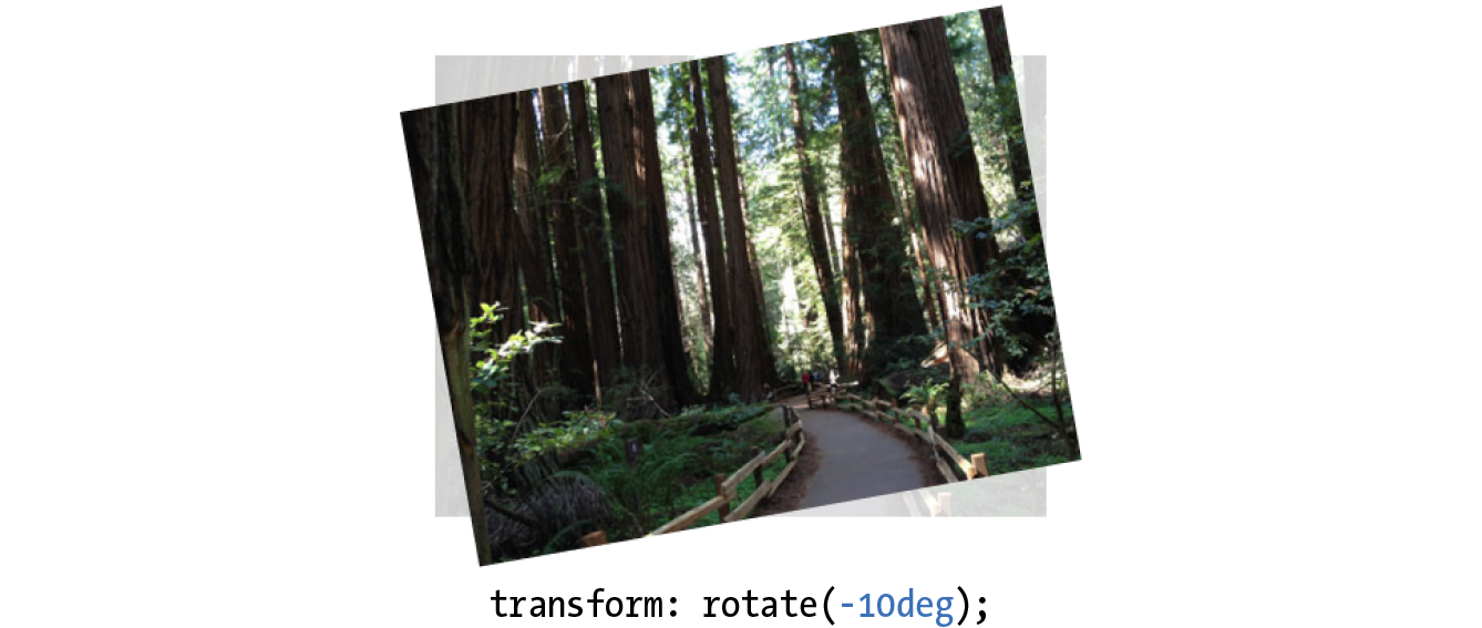
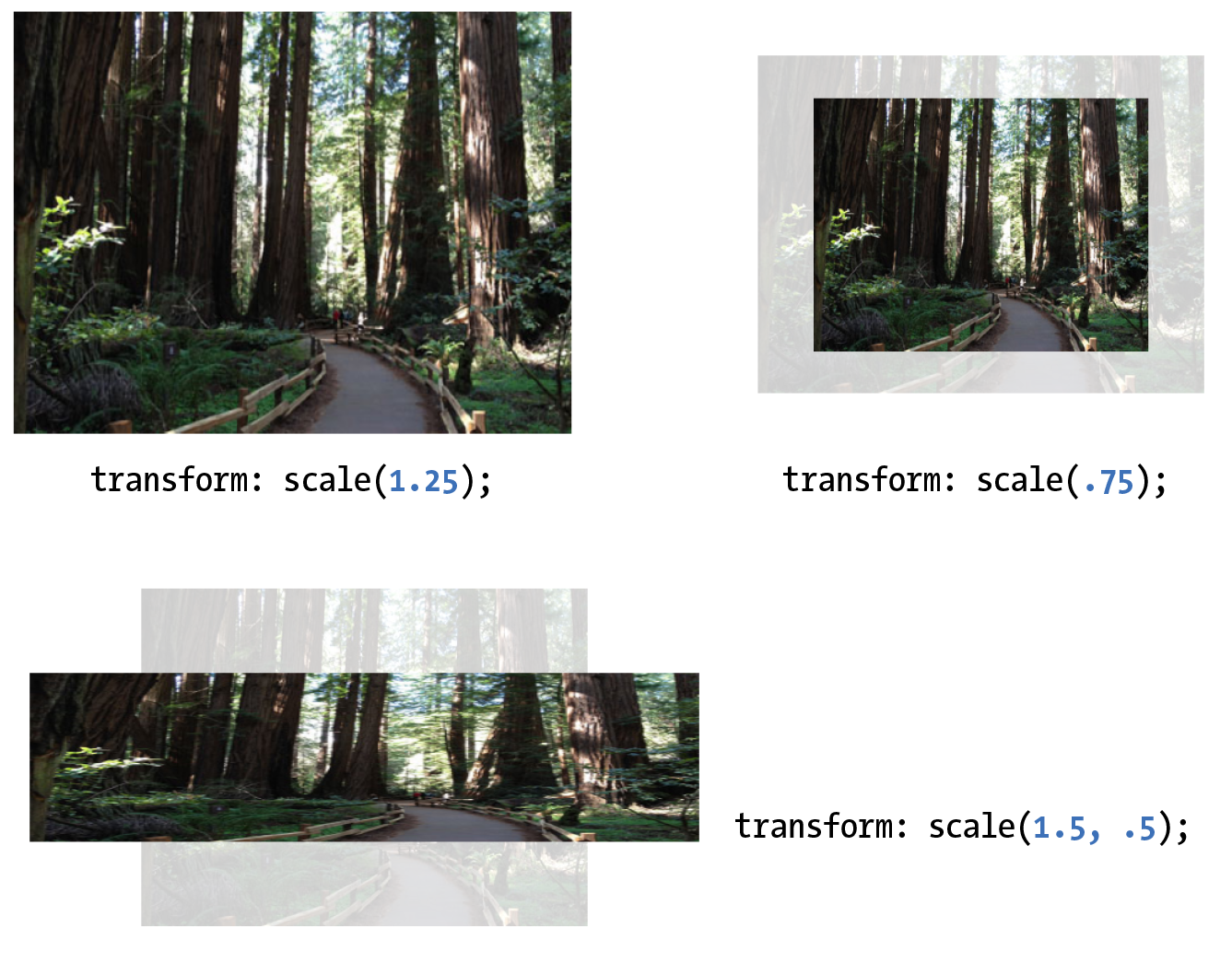
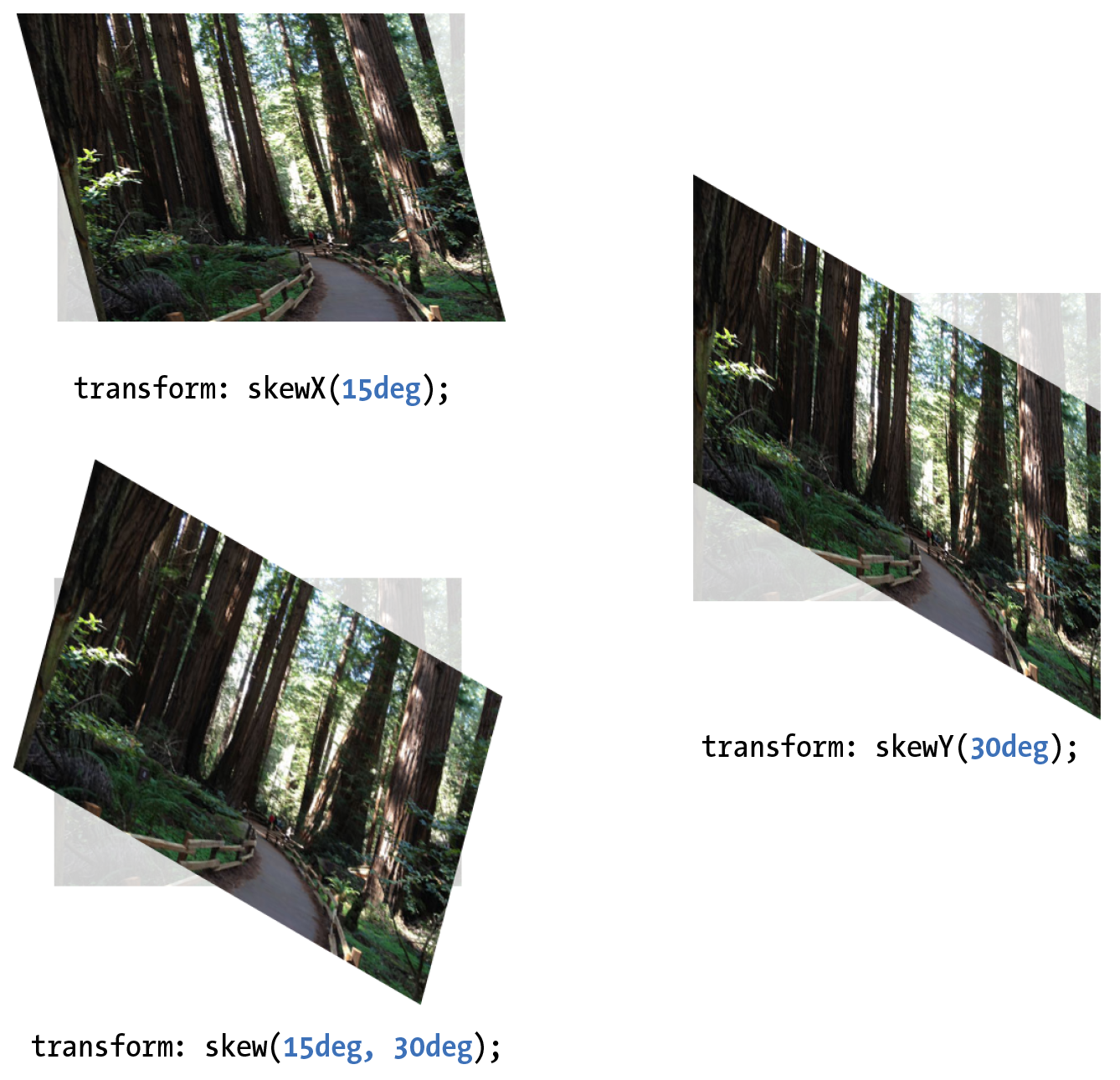
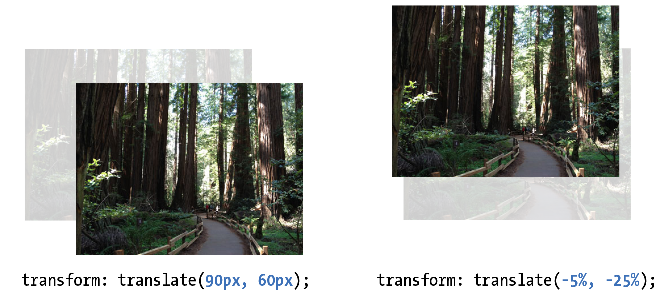
Property: transform
Values: rotate() | rotateX() | rotateY() | rotateZ() | rotate3d() | translate() | translateX() | translateY() | scale() | scaleX() | scaleY() | skew() | skewX() | skewY() | none
Default: none
Applies to: transformable elements
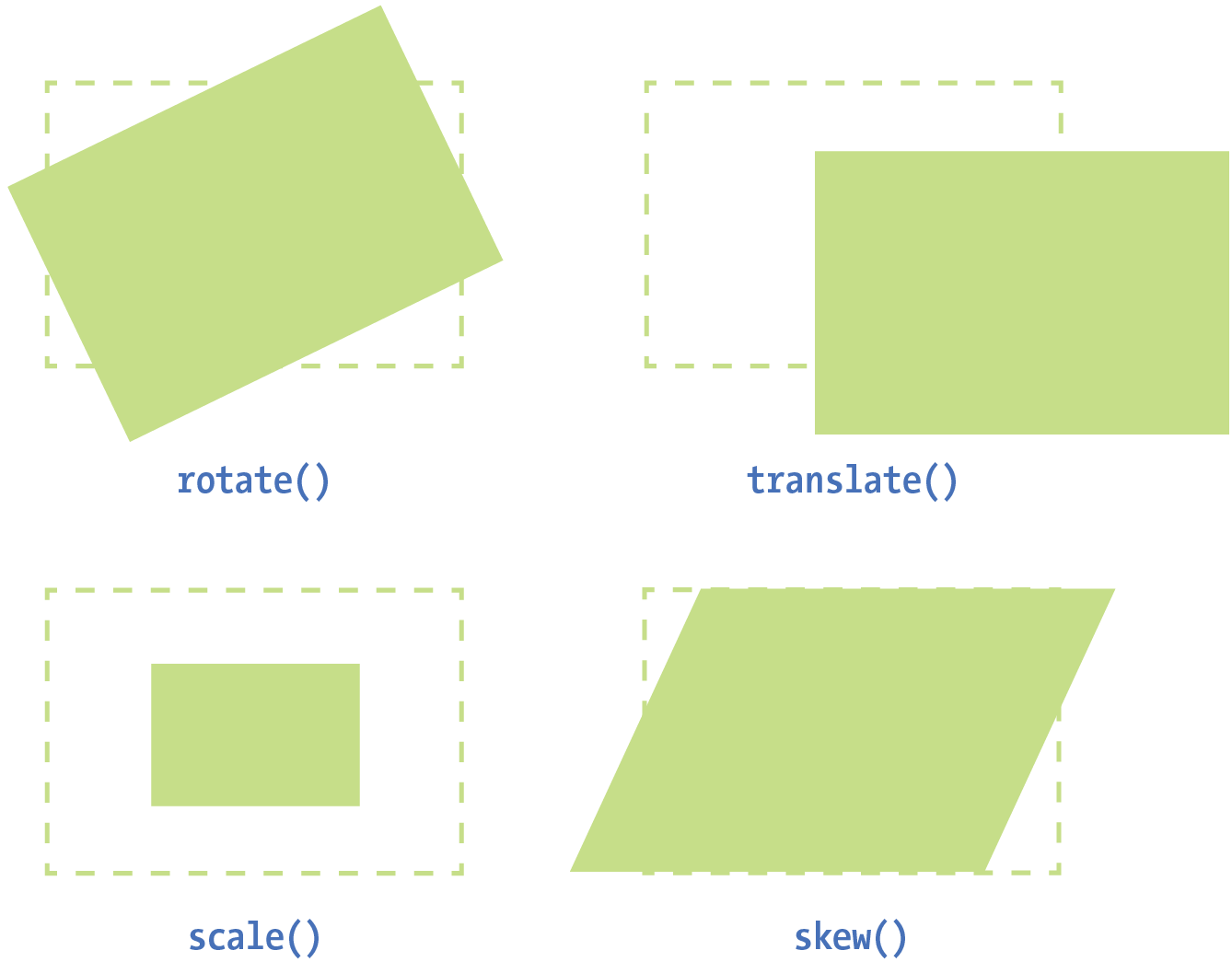
Transformable elements:
- HTML elements with replaced content, such as img, canvas, form inputs, and embedded media
- Elements with their
displayset toblock,inline-block, andflex