What You'll Learn
- Advanced styling (with Bootstrap)
- CSS animation
- Responsive design
- How to create an awesome navbar
We will attempt to recreate a navigation bar from a design. You can have your own design if you're confident. For this project, let's pick a random one on the internet. We will change a few things as we go.
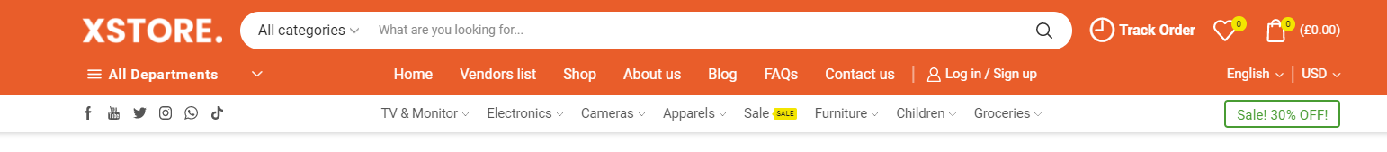
We can use Bootstrap Navbar as a template and go from there.
<Navbar expand="lg" variant="light" bg="light">
	<Container>
		<Navbar.Brand href="#">Navbar</Navbar.Brand>
	</Container>
</Navbar>
- Find a logo you want to use and import it:
import logo from '../images/logo.png';
- Add a logo image instead of the text
Navbar:
<Navbar.Brand href="#">
	<img src={logo} alt="" width="200px" />
</Navbar.Brand>
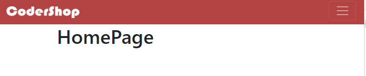
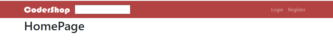
To change the background color of this Navbar, you need to give it a custom className. Notice that Bootstrap Navbar has the prop bg="light". If you read the documentation, you will find that whatever text we add to this prop will be the className of the component with the prefix bg-. We can set a custom className for this by modifying the prop:
<Navbar bg="custom" expand="md">
Now if we want to style this Navbar, we can set CSS rules for the class .bg-custom.
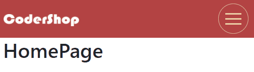
- Let's give it a different background color! In your CSS file:
.bg-custom {
	background-color: rgb(179, 67, 67);
}
Remember to set variant to dark if you have a dark background so the text will be light and readable.
We also want some navigation links on the right side of this Navbar. To add the links, we need to wrap them in a Nav component. To move this Nav component to the right side, we add the className ml-auto (margin left auto).
<Nav className="ml-auto">
	<Nav.Link as={Link} to="/login">
		Login
	</Nav.Link>
	<Nav.Link as={Link} to="/register">
		Register
	</Nav.Link>
</Nav>
We do as={Link} to link this component as a React Router link and not the normal link which will clear our states.
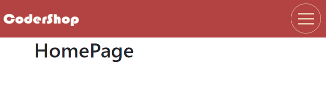
To make this Navbar responsive, we will want to hide these links under a hamburger button when the width of the browser gets small enough.
To do this, simple wrap them in a
<Navbar.Toggle aria-controls="responsive-links" />
    <Navbar.Collapse id="responsive-links">
    <Nav className="ml-auto">
        <Nav.Link as={Link} to="/login">
            Login
        </Nav.Link>
        <Nav.Link as={Link} to="/register">
            Register
        </Nav.Link>
    </Nav>
</Navbar.Collapse>
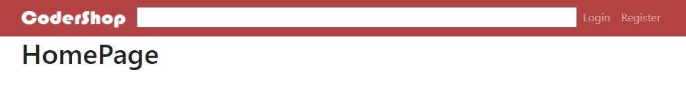
There is a small problem with the responsiveness of this Navbar. Notice that when it's collapsed, there's still some margin around the actual Navbar.
That is due to the expand. This is the breakpoint for collapsing. Since we collapse at md (medium), we want the fluid="md" to
<Container fluid="md">
Now the Navbar will look nicely on smaller devices!
The basic hamburger button provided by Bootstrap is very boring. While you can custom make one yourself, there are many libraries out there to make this button more exciting. hamburger-react is one of them.
Once you have installed it, import it to your Navbar.
import { Twirl as Hamburger } from 'hamburger-react';
const [isOpen, setOpen] = useState(false);
<Navbar.Toggle bsPrefix="navbar-toggler hamburger-button" children={<Hamburger toggled={isOpen} toggle={setOpen} />} aria-controls="responsive-links" />
To understand what those props mean, you must read Bootstrap documentation for
children: The content of this toggle, which is the hamburger icon.bsPrefix: The custom class(es) for this component.navbar-toggleris the default class. We want to customize it further, but not ruin it for the other navbar togglers (although there are none at the moment), so we add our own custom classhamburger-buttonto it.
In CSS, customize the button until you are happy with it. Remember to use !important to overwrite Bootstrap own attributes.
.hamburger-button {
	color: rgb(235, 205, 165) !important;
	border-radius: 50% !important;
	border: 1px solid rgb(221, 189, 147) !important;
	padding: 5px !important;
}
You should now see some cool animation if your browser is small enough!
All eCommerce websites have a search bar in their navigation bar. Let's create our own!
Make a new component SearchBar and add an input in it.
const SearchBar = () => {
	return (
		<div>
			<input />
		</div>
	);
};
Consume this component in the Navbar so it shows up between your logo and the Login + Register links.
<Navbar.Collapse id="responsive-links">
	<SearchBar />
	<Nav className="ml-auto">
		<Nav.Link as={Link} to="/login">
			Login
		</Nav.Link>
		<Nav.Link as={Link} to="/register">
			Register
		</Nav.Link>
	</Nav>
</Navbar.Collapse>
Ignoring the fact that it's incredibly ugly, what should we do to span the input across the Navbar?
What if we set the width of the input to 100%? Notice that the input is actually inside another div. When you set something's width to 100%, you actually set it to 100% of the parent's width. Because this parent div doesn't actually have a width, this 100% value won't work. Therefore we need to expand this div to the max. If you inspect Navbar.Collapse which is really
<div class="navbar-collapse collapse"></div>
you will see that it is actually a flex container. Add flex-grow : 1 to the SearchBar to make it span out (read more about flex-grow). The reason 1 works is that the default value for this is 0. Because the grow factor of SearchBar is infinitely higher than that of Nav, it will ‘grow' as much as possible and span across the Navbar.
If you put SearchBar before Navbar.Collapse, then you will need to set its flex-grow to a higher number like 10 to offset the grow factor of Navbar.Collapse which is 1. Your result should look like this:
Now let's refactor our code a bit. Let's give the wrapper div and the input element each a class name.
const SearchBar = () => {
	return (
		<div className="search-bar">
			<input className="search-bar-input" />
		</div>
	);
};
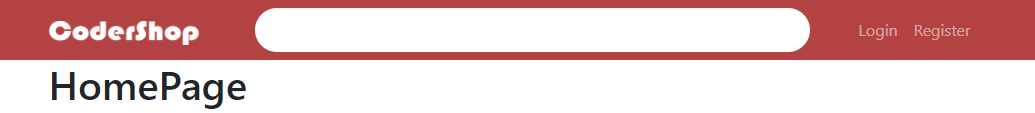
With those class names, you can now make your search bar look better! Here's a suggestion:
.search-bar {
	flex-grow: 1;
	position: relative;
	margin-left: 40px;
	margin-right: 40px;
}
.search-bar-input {
	border-radius: 30px;
	border: none;
	padding: 10px 40px 10px 20px;
	width: 100%;
}

.search-bar-input:focus {
	outline: none;
}
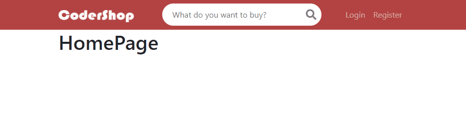
Result:
It looks better now but you can still improve it further! Let's add more things to this search bar such as the search icon and some placeholder text.

Import a search icon from Font Awesome (instructions).
In order to place the icon on top of the search bar, you can make the search-bar div relative and the icon absolute. Then you can center the icon using this trick. In the end, you will have something like this:
<div className="search-bar">
	<input className="search-bar-input" placeholder="What do you want to buy?" />
	<FontAwesomeIcon icon={faSearch} size="lg" color="gray" style={{ position: 'absolute', top: '50%', right: '10px', transform: 'translateY(-50%)' }} />
</div>
Right now, if we go to the mobile version, the search bar will be hidden and only show when you toggle the hamburger menu, and/or that it's displayed BEFORE the Login/Register links.
BEFORE
This is not good UX/UI as we want the search bar to be as accessible as possible for an eCommerce web.
One way to solve this problem is to render the search bar conditionally. If the view width is large (i.e. normal navbar) then we will render it in the middle. If the view width is small (i.e. hamburger navbar) then we render it on the second row of the Navbar outside of the hamburger collapsible content.
AFTER
To achieve this, we can use Bootstrap classes with breakpoints to hide/display elements (documentation).
d-md-none: Frommd(768px) and UP, it will have the attributedisplay : none.d-md-block: Frommdand UP, it will have the attributedisplay : block.
We can also combine classes to allow for more complex conditions.
d-md-block d-none: Visible only frommdand up.
What we need to do now is to hide the search bar when the screen is smaller than md (because the breakpoint for the navbar is md), and display another search bar (which is hidden from md and up) below the real navbar.
For the current search bar:
<div className="d-md-block d-none flex-fill">
	<SearchBar />
</div>
This will show the div (display : block) when the screen width is md or larger, and hide it for the rest of the cases. We need flex-fill because this div is now a flex item and we want to span it to fill the available space (flex: 1). Previously we had this in the
When you test it, resize your screen and you should see the search bar disappear when it's small enough.
Now you need to add another search bar after the current Navbar. Wrap them in a <> or SearchBar as well, but this time we need to hide it from md and up. We need to also apply the Navbar background color to this div and add some padding. Test and change it until you're happy.
<>
<Navbar></Navbar>
<div className="d-md-none bg-custom p-3">
<SearchBar />
</div>
</>