Demo
Today we'll combine our knowledge of HTML, CSS, & Flex to create a beautiful webpage.
What You'll Learn
- The process of creating a website
- How to apply your CSS knowledge from previous lessons
Slides
- Create a new repository named Spotify on Github, then clone it to a folder on your machine (hint).
- Create an
index.htmlfile and astyle.cssfile. - Create a folder called
imagesand put the images (download) inside that folder.
You should have a structure like this:
.
├─index.html
└─style.css
└─images
  └───balloon.png
  └───logo.png
  └───...
Optional: You can also set up a font for this project. You can use Google Fonts which are free. For example, the font Cabin:
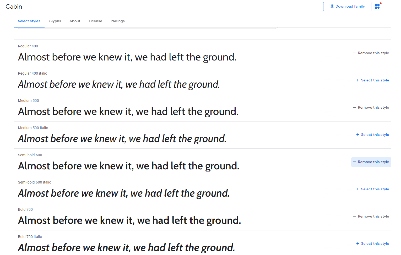
- Click "Select this style" for all the styles that you want (in our case, we want 400, 500 , 600, 700 sizes)
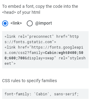
- Copy the
linktag and paste it to your HTML file in theheadsection. - When you want to use this font, add the CSS rule to the appropriate element.
If you look at the website in its entirety, you should see invisible boxes that contain all the texts and images:
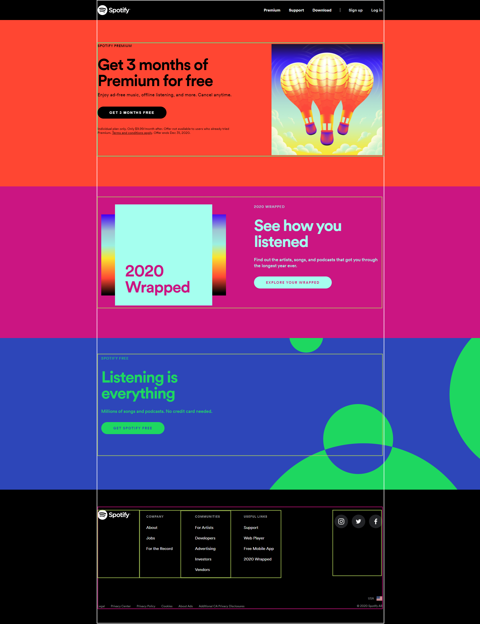
The website is made up of several sections: a black navbar, three main colorful sections in the middle, and a black footer.
<!DOCTYPE html>
<html lang="en">
  <head>
    <meta charset="UTF-8" />
    <meta name="viewport" content="width=device-width, initial-scale=1.0" />
    <link rel="stylesheet" href="style.css" />
    <title>Spotify</title>
  </head>
  <body>
    <nav></nav>
    <section id="section1"></section>
    <section id="section2"></section>
    <section id="section3"></section>
    <footer></footer>
  </body>
</html>
Using flexbox, we can recreate this website to an extent.
Notice that there is empty space on the left and right sides. It means the content element has a max-width property. The content will never expand beyond this value even if the screen size is much larger. This is a common behavior of a container. Popular sites like Facebook, Stack Overflow, Twitter,... all use some form of container.
There is much more to this as we need to consider smaller screens as well, but for this project, let's set up this container to have max-width: 1140 px like on Spotify website.
.container {
  max-width: 1140px;
  margin: 0 auto; /*  center this div with margin left and right auto */
}
Now all your content should go inside this container, even the Navbar texts:
<nav>
  <div class="container"></div>
</nav>
<section id="section1">
  <div class="container"></div>
</section>
<section id="section2">
  <div class="container"></div>
</section>
<section id="section3">
  <div class="container"></div>
</section>
<footer>
  <div class="container"></div>
</footer>

The Navbar consists of 2 main things: A logo and a group of links.
- Add the logo image to your nav (set the
widthto130px). - Add the links.
You can use ul and li like on the website, or you can just use div like here. Both ways should work.
<nav>
  <div class="container">
    <img src="url here" width="130" />
    <div class="links">
      <a href="#">Premium</a>
      <a href="#">Support</a>
      <a href="#">Download</a>
      <span>|</span>
      <a href="#">Sign up</a>
      <a href="#">Log in</a>
    </div>
  </div>
</nav>
- Put the 2 elements on the same row using
display: flex. - Similarly, do the same for the links
div. - Change the background color of this
navto black and the color to white, give it a height of 80px.
You should have something like this:

- Spread the 2 elements to the opposite ends (remember CSS Challenge 1?).
- Center the content vertically.
- Remove the underline from ALL the links with
text-decorationCSS property. - Make ALL the links turn green
#1ed760when you hover over them. - Add the property
pointer-events: noneto thespantag that contains the divider "|" so when you hover over it, the cursor won't turn into a text cursor. - Finally, fix this nav to the top of the page with
position: fixedandwidth: 100%.
This is the end result:

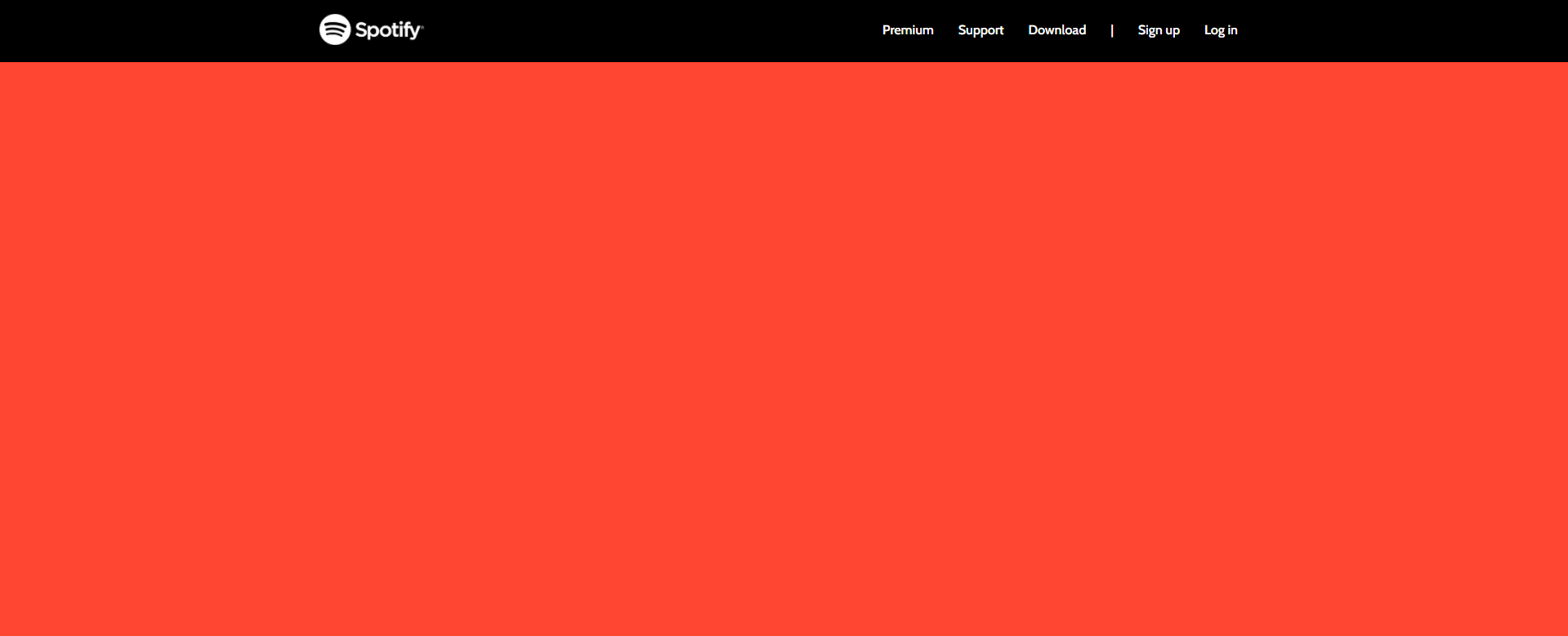
Because the Navbar is now fixed, it goes over our #section1. Try adding some text to this section, you will not see the text at all as it is covered by the Navbar.
- Add
padding-top: 80pxto#section1so it will ignore the part that is covered by the Navbar. - Use the DevTools to find the correct background color and set it as the background color of this whole section.
- Give this section a
min-heightof70vhwhich means that the height will never be smaller than 70% of the viewport.
You should have an empty page like this:
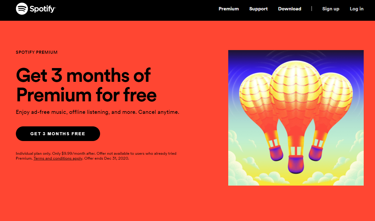
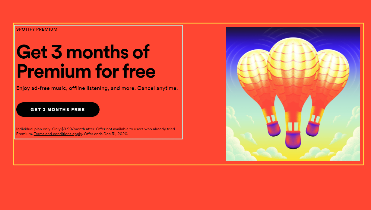
- Add the content and use flexbox to properly display the content.
<div class="container">
  <div class="content">
    <div class="text">
      <div class="title1">SPOTIFY PREMIUM</div>
      <div class="title2">Get 3 months of Premium for free</div>
      <div class="description">
        Enjoy ad-free music, offline listening, and more. Cancel anytime.
      </div>
      <button class="button">GET 3 MONTHS FREE</button>
      <div class="note">
        Individual plan only. Only $9.99/month after. Offer not available to
        users who already tried Premium. Terms and conditions apply. Offer ends
        Dec 31, 2020.
      </div>
    </div>
    <img src="url here" />
  </div>
</div>
- Set
flex-basis: 50%for the class.textso it will only occupy 50% of the width of the flexbox (read more on flex-basis).
Negative : Don't spend too much time on styling this part!
- Create 2 div for the 2 columns.
- Find out the
min-heightof this section and set it accordingly.
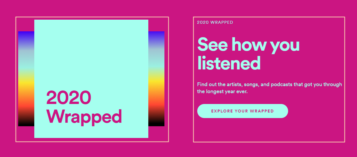
We have 2 columns of similar sizes.
The right column is the same as in Section 1.
- Add the content for the right column.
As for the left column, it is very similar to Challenge 3, only that the div 2 is slightly expanded (note: this won't be responsive since we set fixed width and height for the boxes):
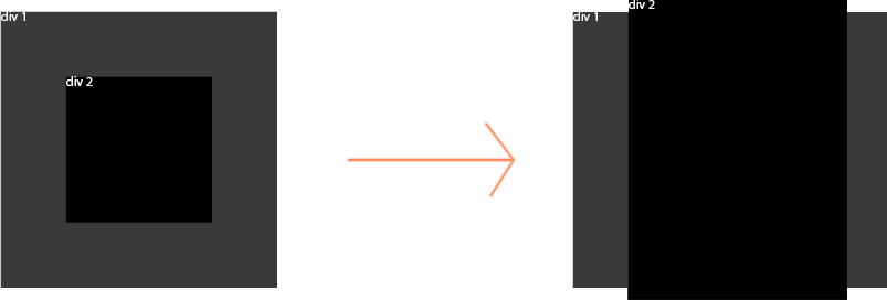
- Stack 2 boxes for the left column.
- Center the "inner" box.
Another way to center an absolute element inside a relative element:
top: 50%;
left: 50%;
transform: translate(-50%, -50%);
The gradient underneath is just the background color of a div.
- Use the DevTools to get the correct gradient.
Positive : A lot of the classes in Section 1 can be reused here. The only differences are the background color and the font color.
You should be able to breeze through this section. The background is an svg image which you should have already and can be added using this CSS:
#section3 {
  padding-top: 80px;
  background-image: url(/images/LiE_circles.svg);
  background-size: auto 100%;
  color: #1ed760;
  background-color: #2d46b9;
  background-position: right center;
  background-repeat: no-repeat;
  min-height: 606px;
}
The result:

- Add the content with the right color scheme.
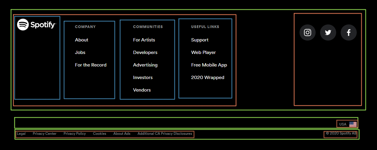
- Create multiple
divand enter everything before you style this footer. - Add the 3 social media icons in a
div. - Wrap every link in an
atag, even the icons.
<footer>
  <div class="container">
    <div>
      <div>
        <div>
          <img src="images/logo.png" width="130" />
        </div>
        <div>
          <div>Company</div>
          <a href="#">About</a>
          <a href="#">Jobs</a>
          <a href="#">For the Record</a>
        </div>
        <div>
          <div>Communities</div>
          <a href="#">For Artists</a>
          <a href="#">Developers</a>
          <a href="#">Brands</a>
          <a href="#">Investors</a>
          <a href="#">Vendors</a>
        </div>
        <div>
          <div>Useful Links</div>
          <a href="#">Support</a>
          <a href="#">Web Player</a>
          <a href="#">Free Mobile App</a>
          <a href="#">2020 Wrapped</a>
        </div>
      </div>
      <div class="footer-right">
        <a href="#">
          <img src="images/ig.png" width="50" />
        </a>
        <a href="#">
          <img src="images/fb.png" width="50" />
        </a>
        <a href="#">
          <img src="images/twitter.png" width="50" />
        </a>
      </div>
    </div>
    <div class="row2">USA <img src="images/usa.jpg" width="20" /></div>
    <div>
      <div>
        <a href="#">Legal</a>
        <a href="#">Privacy Center</a>
        <a href="#">Privacy Policy</a>
        <a href="#">Cookies</a>
        <a href="#">About Ads</a>
        <a href="#">Additional CA Privacy Disclosures</a>
      </div>
      <div>© 2020 Spotify AB</div>
    </div>
  </div>
</footer>
Feel free to structure this however you think is the best way.
- Give the elements appropriate classes and use flexbox to display them correctly.
- Style the texts
Live website
HTML
Solution available the day after
CSS
Solution available the day after