- We'll use the Bootstrap Grid, as well as a few extra components, to finally build out all the visual elements of our page.
- Some screenshots of what we'll build:
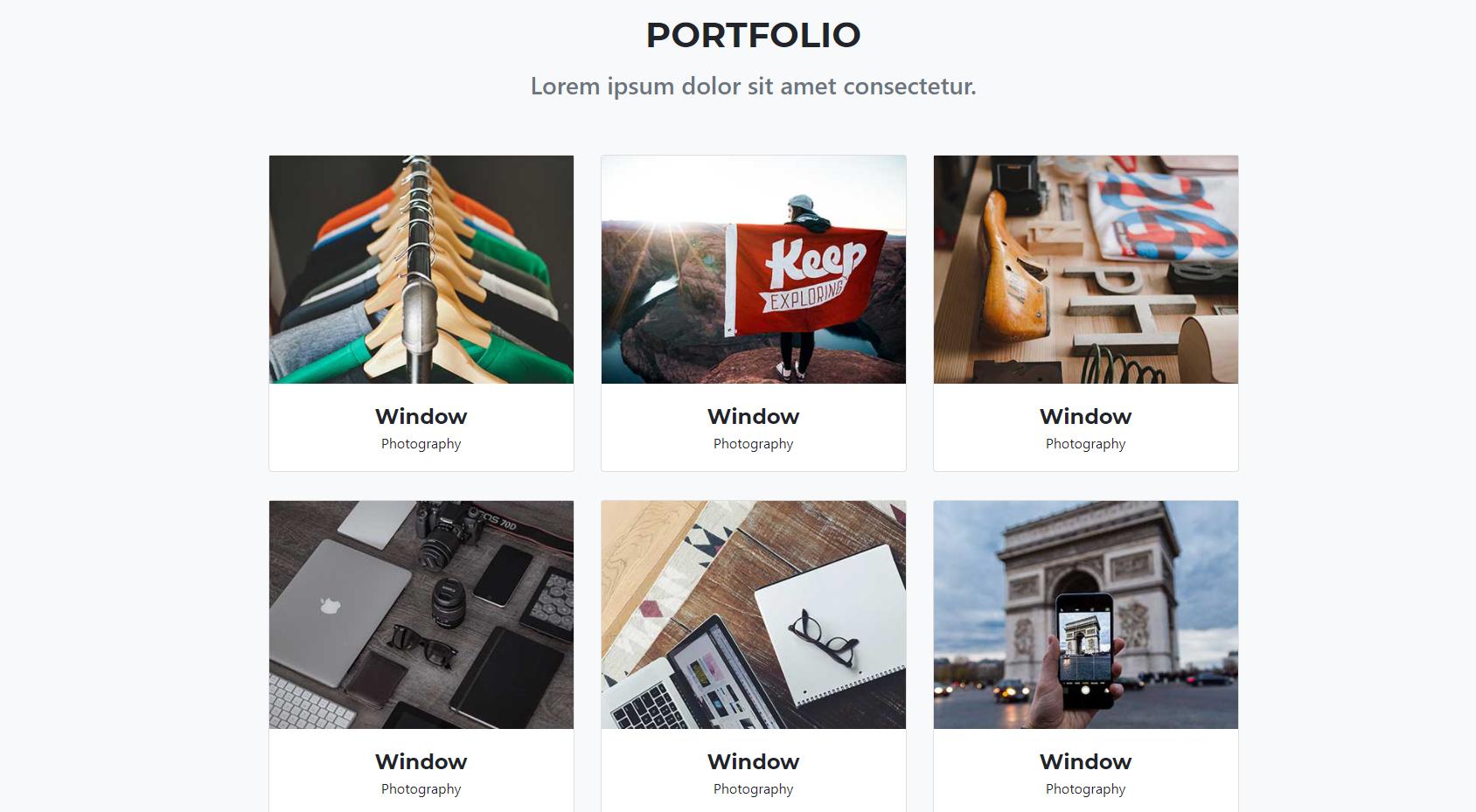
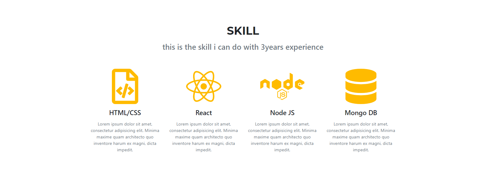
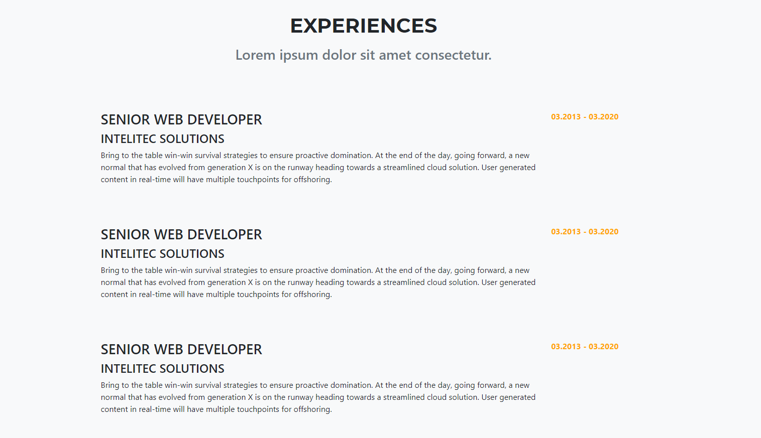
We'll be using really similar attributes from last time! You should start getting familiar with these attributes.
Background Attributes
background-imagebackground-positionbackground-sizebackground-color
Padding and Margin
paddingmargin
Font-Related
colorfont-sizefont-stylefont-familyfont-weight
Other
border-radiusmax-widthwidthheighttransformtransition
Bootstrap Classes
text-center: center align your text (same as just sayingtext-align: center)container: make the div section go to the center and max-width is 1140pxmy-3: 1rem margin, in the y-direction (top and bottom). For more cool tricks like these, check out the classes at Bootstrap spacing
- Let's try to imagine all the "components" that make up our website. Here's one guess.
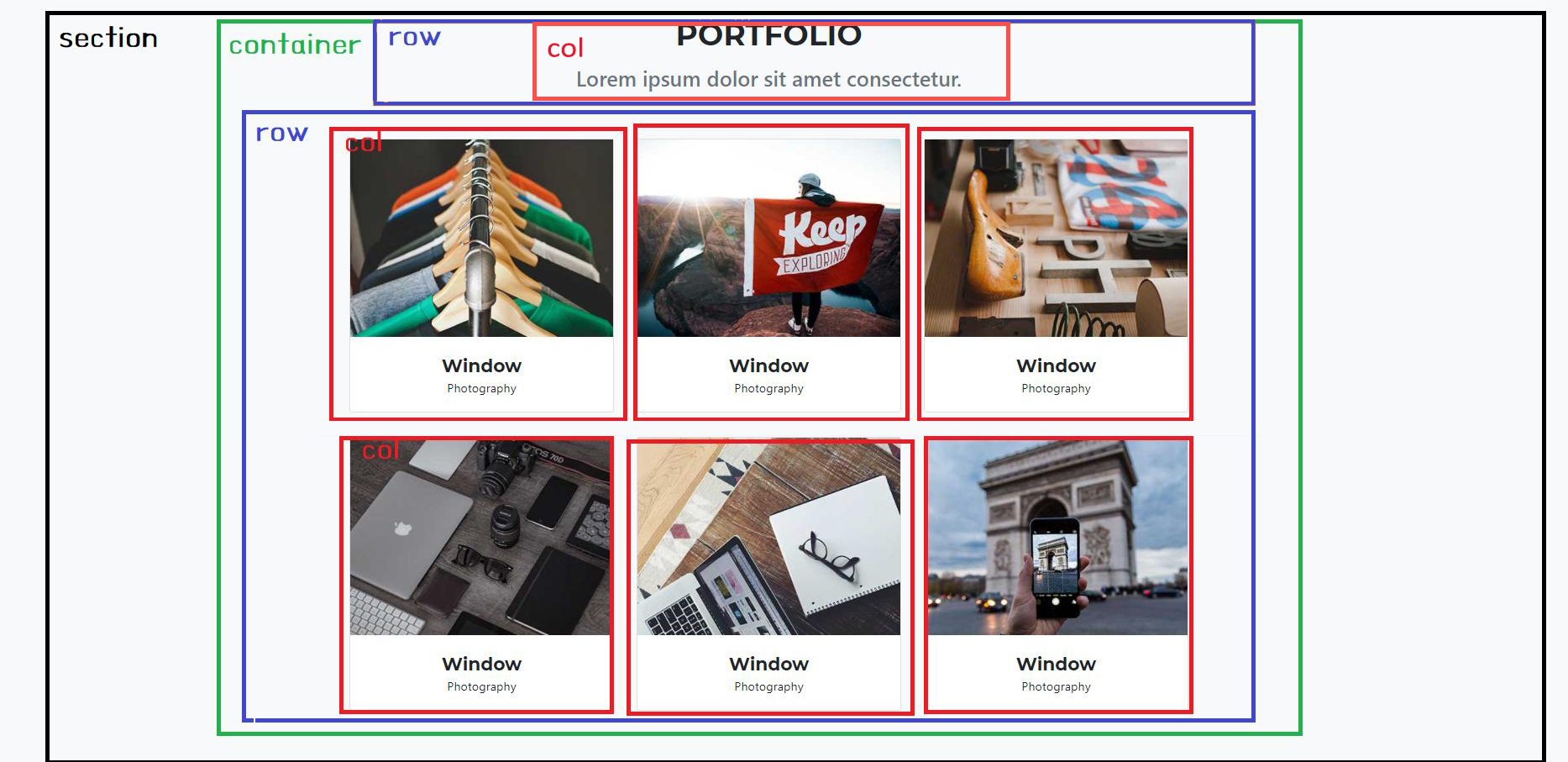
- Once you've identified the respective components, translating into code is easy! Basically, each of the boxes becomes a
div.
<div class="bg-light section-padding" id="portfolio">
	<div class="container">
		<div class="text-center">
			<h2 class="section-heading">PORTFOLIO</h2>
			<h3>Lorem ipsum dolor sit amet consectetur.</h3>
		</div>
		<div class="row">
			<div class="col-lg-4">card will be here</div>
			<div class="col-lg-4">card will be here</div>
			<div class="col-lg-4">card will be here</div>
			<div class="col-lg-4">card will be here</div>
			<div class="col-lg-4">card will be here</div>
			<div class="col-lg-4">card will be here</div>
		</div>
	</div>
</div>
- Each column has a card. So let's grab the card component from bootstrap which we saw briefly last time. https://getbootstrap.com/docs/4.5/components/card/
- Choose "card with an image cap"
- Paste your card component into each col. Replace the
srcbelow with the address to another image, or you'll just see a broken image.
<div class="card">
	<img
		src="..."
		class="card-img-top"
	/>
	<div class="card-body">
		<div>Window</div>
		<div>Photography</div>
	</div>
</div>
- Now we'll just play with some padding and spacing. Here are our suggestions, feel free to play around with the numbers until you find something that looks good for you.
/* this is for entire section spacing. */
.section-padding {
	padding-top: 96px;
	padding-bottom: 96px;
}
/* this is for title of section. be sure you have installed the right font! */
.section-heading {
	font-size: 40px;
	margin-bottom: 16px;
	font-family: "Montserrat";
	font-weight: 700;
}
/* this is for sub title of section */
.section-subheading {
	margin-bottom: 64px;
}

/* this is for each card title. be sure you have the right font! */
.portfolio-caption-heading {
	font-size: 24px;
	font-family: "Montserrat";
	font-weight: 700;
}

/* this is for each card spacing */
.card {
	margin-bottom: 32px;
}
/* :hover is a rule that applies when the user's mouse is hovered over a .card element */
.card:hover {
	background-color: rgba(255, 238, 0, 0.5);
	transform: scale(1.05);
	transition: 0.25s;
}
/* this is so that all the images will be resized to a fixed height so the cards won't have mismatching heights */
.card-img-top {
	height: 200px;
	object-fit: cover;
}
Fontawesome is a website that provides you some cute icons. Instead of downloading a zillion images, it's much more convenient to use this font.
- To install, add this to your
headtag.
<script src="https://use.fontawesome.com/releases/v5.15.1/js/all.js" crossorigin="anonymous"></script>
- To use it, first, search for the name of the icon you want at https://fontawesome.com/.
- Once you find the icon, it will give you the
<i>tag. All you need to do is copy that<i>tag and put into your html body anywhere you want. For example, let's search for "Earth". You should see this: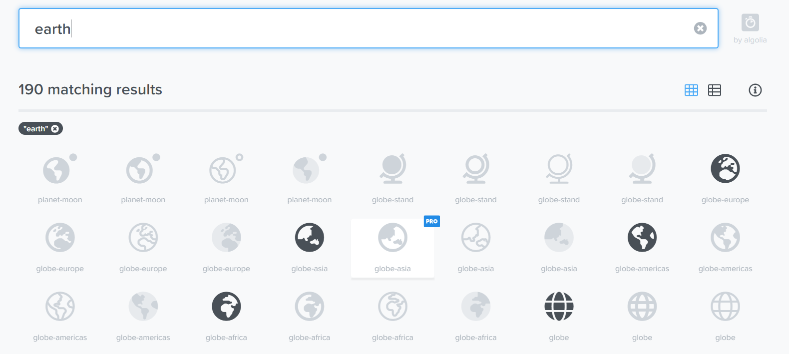
- Note that for the free version, not all icons are available. The grayed out ones are for the Pro version. Let's click on globe-asia and copy the
<i>tag on the new page: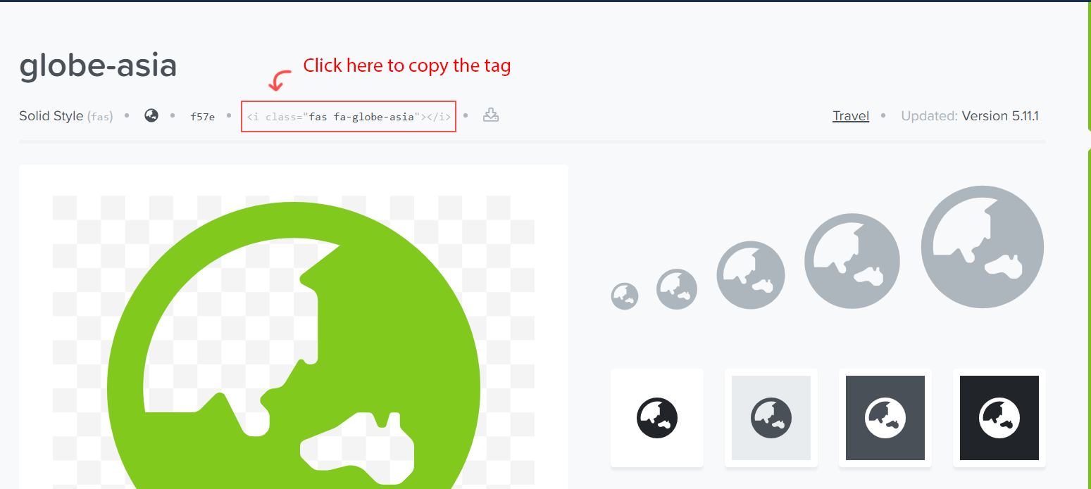
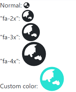
- Paste it into your HTML and you should see the icon. You can apply Fontawesome's own classes to change the size:
Actually, this section is easier than the portfolio, so maybe we should've started here ;). Think upon the structure again.

- Set up the structure for this section:
<div class="section-padding" id="skill">
	<div class="container">
		<div class="row text-center">
			<div class="col-12">
				<h2 class="section-heading">Skill</h2>
				<h3 class="section-subheading text-muted">Lorem ipsum dolor sit amet consectetur.</h3>
			</div>
		</div>
		<div class="row">
			<div class="col-lg-3">card will be here</div>
			<div class="col-lg-3">card will be here</div>
			<div class="col-lg-3">card will be here</div>
			<div class="col-lg-3">card will be here</div>
		</div>
	</div>
</div>
- Add the cards, this time with Fontawesome icons in the form of
<i>tags:
<div class="row text-center">
	<div class="col-lg-3">
		<i class="far fa-file-code icon-style"></i>
		<h4 class="my-3">HTML/CSS</h4>
		<p class="text-muted">
			Lorem ipsum dolor sit amet, consectetur adipisicing elit. Minima maxime quam architecto quo inventore harum ex magni, dicta impedit.
		</p>
	</div>
</div>
- Style the icons so they match your color scheme:
.icon-style {
	font-weight: 800;
	font-size: 128px;
	color: rgb(255, 187, 0);
}
Now, we get to work a bit more with the "grid".
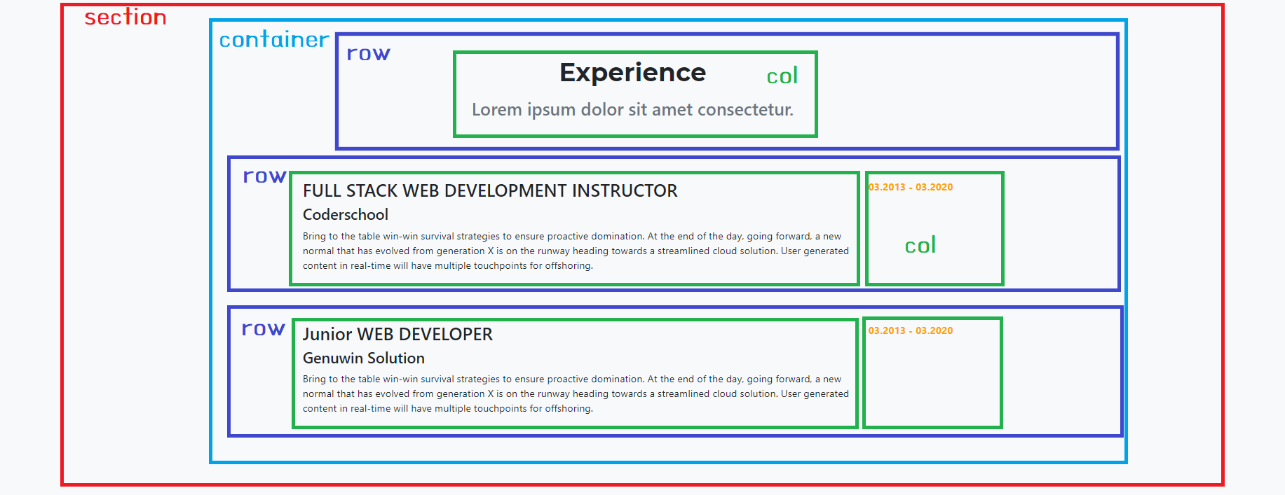
- Create your Experience grid. This time it will be a little different. Each row will have 2 columns of different sizes:
<div class="bg-light section-padding" id="experience">
	<div class="container">
		<div class="row text-center">
			<div class="col-12">
				<h2 class="section-heading">Experience</h2>
				<h3 class="section-subheading text-muted">Lorem ipsum dolor sit amet consectetur.</h3>
			</div>
		</div>
		<div class="row experience-row">
			<div class="col-lg-10">Some text</div>
			<div class="col-lg-2 experience-date">Some date</div>
		</div>
		<div class="row experience-row">
			<div class="col-lg-10">Some text</div>
			<div class="col-lg-2 experience-date">Some date</div>
		</div>
	</div>
</div>
- Now add more content to the body of those rows:
<div class="row experience-row">
	<div class="col-lg-10">
		<h3>FULL STACK WEB DEVELOPMENT INSTRUCTOR</h3>

		<h4>CoderSchool</h4>
		<p>
			Writing the world's best assignments to teach the principles of HTML, CSS, which are incredibly difficult. Just kidding, we find it really easy and hope you do too!
		</p>
	</div>
	<div class="col-lg-2 experience-date">
		<span>03.2013 - 03.2022</span>
	</div>
</div>
- Finally, style the dates so they can look less boring:
.experience-date {
	color: orange;
	font-weight: bold;
}
Let's make a bonus feature!
- When you click a portfolio card, it will open a popup (Modal) to show your project
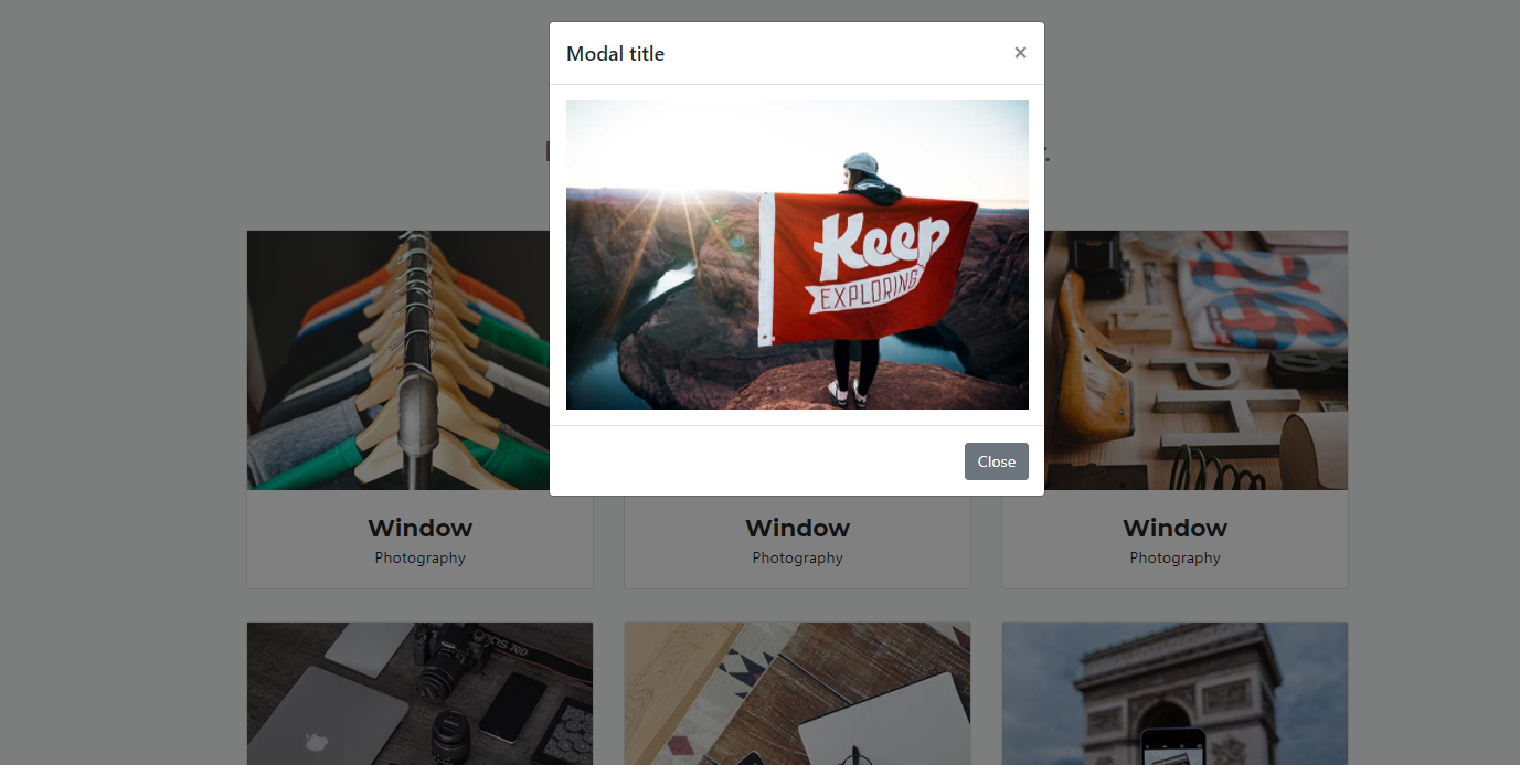
- First, Let's grab the Modal feature from Bootstrap. https://getbootstrap.com/docs/4.5/components/modal/ You can click here to see the live demo.
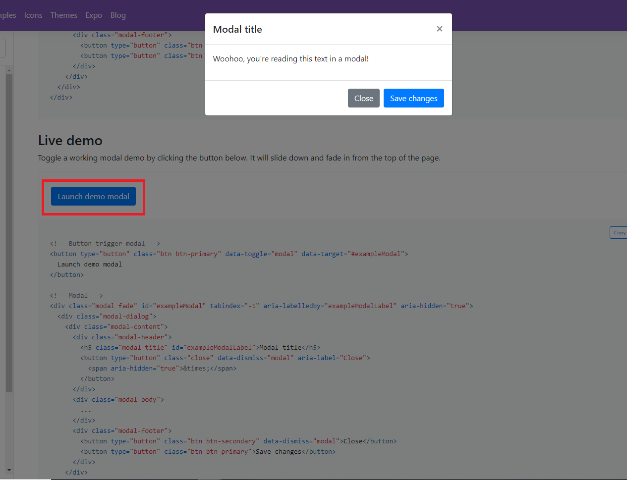
- Let's see how this modal works.
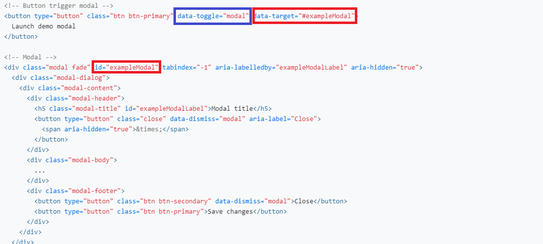
- Card attributes, which are generally prefixed with "data".
data-toggle: This means that this element has the power to toggle things, which means to set things on or off. This can toggle a modal.data-target: Theidof the target modal. When you click the card, the modal with this id will open up. This should begin with a#.
- Modal attributes:
id: id for each modal. It's the same id used in thedata-targetattribute for the correspoding card. This value should be unique for each modal.
- Now let's copy the code and put into our project. We're going to write the modal itself first, and then toggle it in a different spot (the button's
data-toggleanddata-targetwill be moved to the portfolio cards instead).
Put this code under the Experience Section.
<!-- Modal -->
<div class="modal fade" id="exampleModal" tabindex="-1" aria-labelledby="exampleModalLabel" aria-hidden="true">
<div class="modal-dialog">
<div class="modal-content">
<div class="modal-header">
<h5 class="modal-title" id="exampleModalLabel">Modal title</h5>
<button type="button" class="close" data-dismiss="modal" aria-label="Close">
<span aria-hidden="true">×</span>
</button>
</div>
<div class="modal-body">...</div>
<div class="modal-footer">
<button type="button" class="btn btn-secondary" data-dismiss="modal">Close</button>
<button type="button" class="btn btn-primary">Save changes</button>
</div>
</div>
</div>
</div>
- Put the image into
<div class="modal-body">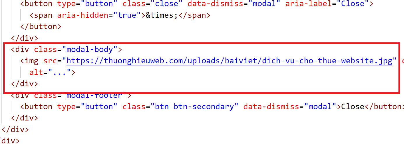
- Give some proper id to your modal.

- Add data-toggle and data-target at the first portfolio card.

- Now let's test it! Go back to your website and click the portfolio card. You will see the modal pop up.
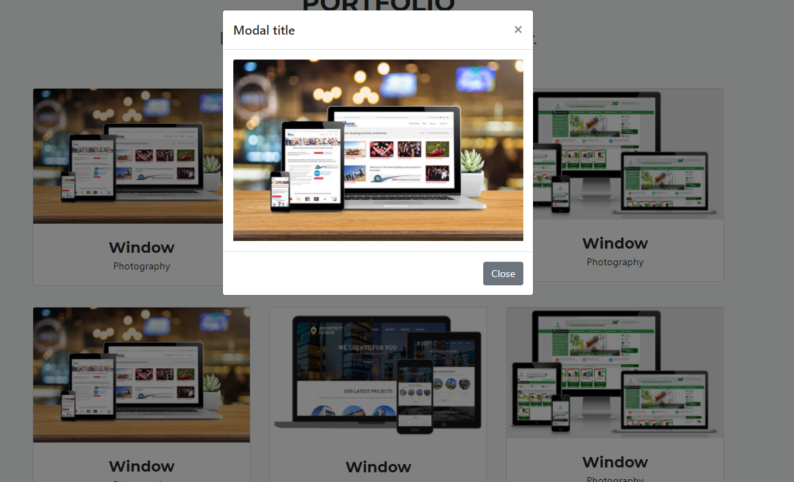
- Now you can add 5 more modals!
