What You'll Learn
- How to include Bootstrap into your project
- How to use some common components like navbars and cards
- How to use some utility classes like
p-5 - More advanced CSS techniques
Demo website: https://bitna-cv.netlify.app/
Lecture Notes
The lecture notes can be found here: 📔 Slides - Precourse 2
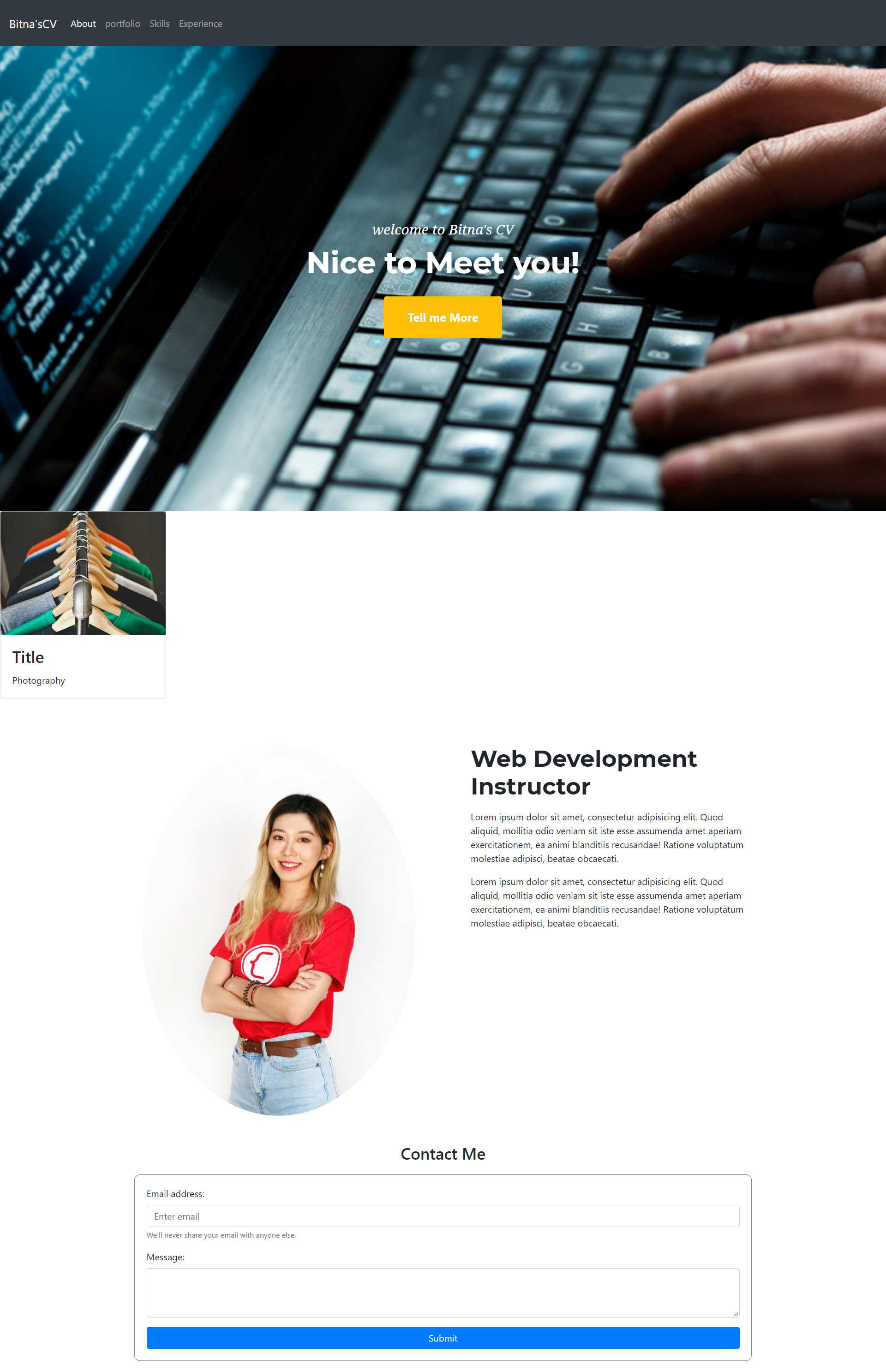
Preview of the Final Product
Not that at this point, you should feel free to be more creative! The great thing about programming is it gives you the power to express yourself however you wish.
There are a lot of CSS Properties - you can view the common ones here on MDN.
For this project, here are some of the ones we're using. Look through this list and familiarize yourself with what they do.
Background Attributes
background-imagebackground-positionbackground-sizebackground-color
Padding and Margin
paddingmargin
Font-Related
colorfont-sizefont-stylefont-familyfont-weight
Sizing
max-widthwidthheight
Other
border-radius
There's a lot of stuff in the Bootstrap library. Here are some common classes that we'll use today, and links to the documentation. Again, skim this list and make sure you're comfortable.
Utility Classes
text-center: center aligns your text. Documentation: Utilities - Textp-3: adds3remof space at the top, bottom, left and right of the element (you can use other numbers, likep-1,p-2...). Documentation: Utilities - Spacing.container: centers a div and gives it a max width, so the content doesn't get super long and wide and ugly. Can be used in a grid, or standalone. Documentation: Layout - Containers.
Bootstrap Components
Components are groups of related code/classes that can be combined to make re-usable things, like navbars, and cards.
Navbar
 https://getbootstrap.com/docs/4.5/components/navbar/
Card
Import Bootstrap CSS / JS
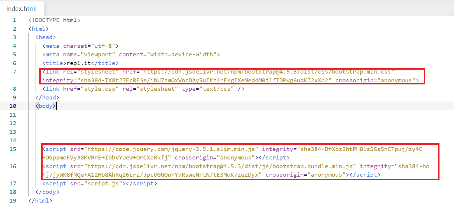
- Go to our repl.it, and create a new HTML/CSS/JS project.
- Go to Bootstrap Getting Started Quick Start and copy the text that looks like
link rel=stylesheet. - Paste the css link into your
<head>tag. - Also copy the text from the JS - Bundle section and paste the link at the bottom of your
<body>tag.
Here's a picture for reference.
Google Fonts
- Go to Google Fonts. You're welcome to choose any fonts you like (that's part of the fun!) but here, we've chosen the very-safe-but-boring choice of
Montserrat.
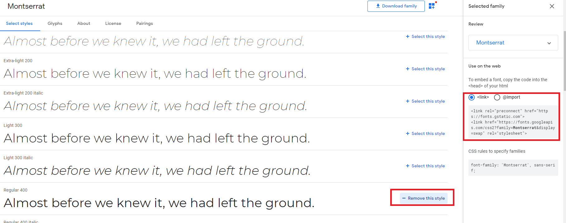
- Copy the link code and paste into your
<head>tag.
<!-- Google fonts-->
<link href="https://fonts.googleapis.com/css?family=Montserrat:400,700" rel="stylesheet" type="text/css" />
- Go to the Bootstrap documentation and for Navbar and copy the template code for the basic navbar https://getbootstrap.com/docs/4.5/components/navbar/.
- Paste this into the top of your page, as the first thing in the
<body>tag.
- Change the text of the navbar by finding the right places to change the text.
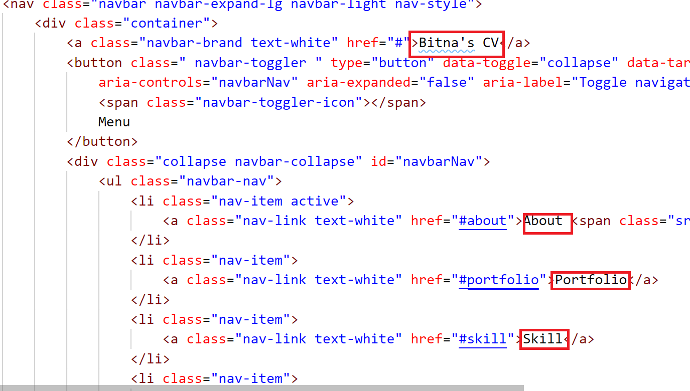
- Note that your Navbar, if set up properly, has some cool responsive behaviors!
While Bootstrap has a "Jumbotron" component, let's build a simple one from scratch so we can understand how it works.
After our navbar, let's make a new div with a class of masthead:
<div class="masthead"></div>
In our CSS, let's apply some styles.
.masthead {
	background-image: url(https://www.open.edu/openlearn/ocw/pluginfile.php/1317197/mod_resource/content/0/sc_1_olhp_786px.jpg);
	background-position: center center;
	background-size: cover;
	padding-top: 300px;
	color: white;
	padding-bottom: 300px;
}
- background-image: Bring the background image from URL.
- background-position: property sets the starting position of a background image. We will center ours. (Reference)
- background-size: property specifies the size of the background image (similar to object-fit). (Reference)

- Add the text inside of image. The
containerclass helps us make our text not too wide.
<div class="masthead">
	<div class="container"></div>
</div>
- Put the text and button inside of container, and add the
text-centerclass ot make sure the text is center-aligned.
<div class="masthead text-center">
	<div class="container">
		<h3 class="mast-subtitle">Welcome to Bitna's CV</h3>
		<h1 class="mast-title">Nice to Meet you!</h1>
		<button type="button" class="btn btn-warning mast-button">Tell me More</button>
	</div>
</div>
Here are the styles for the rest of the section; nothing should be too new here at this point!
.mast-subtitle {
	font-size: 24px;
	font-family: "Montserrat";
	font-style: italic;
}
.mast-title {
	font-size: 52px;
	font-weight: 700;
	font-family: "Montserrat";
}

.mast-button {
	padding-left: 40px;
	padding-right: 40px;
	padding-top: 20px;
	padding-bottom: 20px;
	color: white;
	font-size: 20px;
	font-weight: bold;
	margin-top: 20px;
}
Your final result should look something like thsi: 
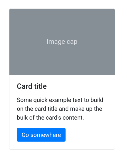
You can build a card of your own, or use Bootstrap Card: https://getbootstrap.com/docs/4.0/components/card/
Let's choose a card with just an image and some texts.
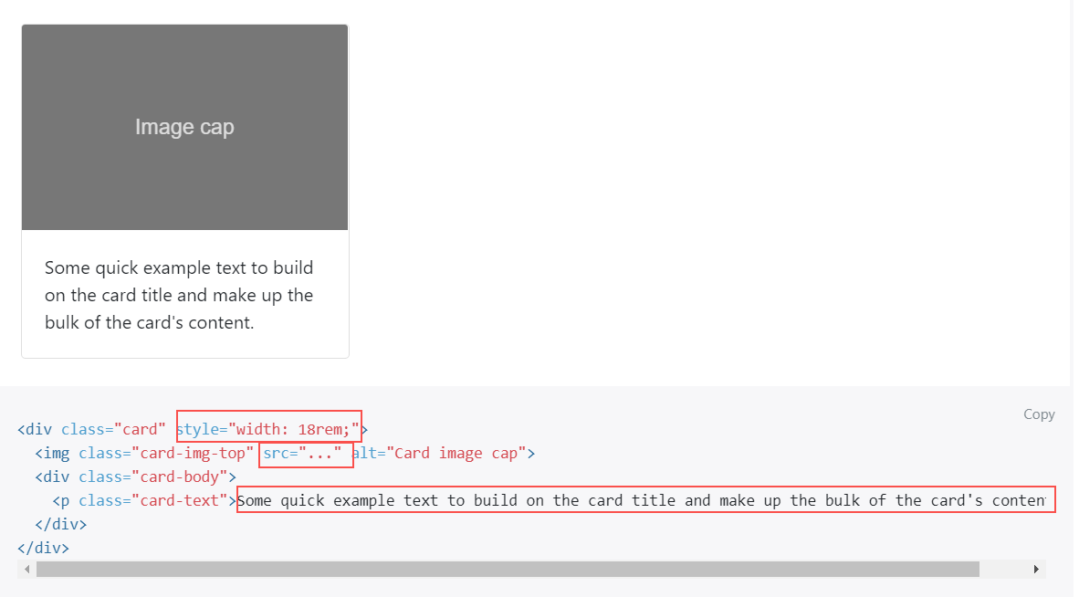
You can change the width by modifying the style attribute.
Replace the image src with your picture url and the content.
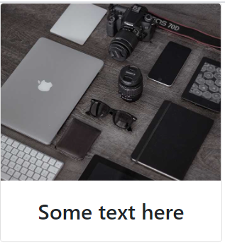
The end result should look like this:
Take a quick look at Bootstrap Forms: https://getbootstrap.com/docs/4.0/components/forms/
Let's create a form by making a new form tag inside a new div:
<div class="container">
	<h3>Contact Me</h3>
	<form class="contact-form"></form>
</div>
In this form, we need an email field and a text field:
<div id="contact" class="container">
	<h3 class="contact-text">Contact Me</h3>
	<form class="contact-form">
		<div class="form-group">
			<label for="emailInput">Email address:</label>
			<input type="email" class="form-control" id="emailInput" aria-describedby="emailHelp" placeholder="Enter email" />
			<small id="emailHelp" class="form-text text-muted">We'll never share your email with anyone else.</small>
		</div>
		<div class="form-group">
			<label for="message">Message:</label>
			<textarea class="form-control" id="message" rows="3"></textarea>
		</div>
	</form>
</div>
Add a button before the closing form:
<button type="submit" class="btn btn-primary">Submit</button>
Now let's add some CSS:
.contact-text {
	text-align: center;
}

.contact-form {
	padding: 20px;
	margin: 20px;
	border-radius: 10px;
	border: 1px solid gray;
	display: flex;
	flex-direction: column;
}
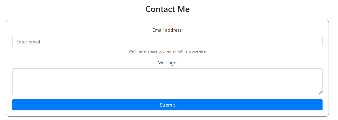
You should see this as a result:
When someone clicks the button "Tell Me More", let's scroll down to the Contact Form we just made.

Wrap the button in an anchor tag. Instead of leading to a new link, we want it to scroll down to the contact form. We can do that by adding the id of the contact form to the href attribute:
<a href="#contact">
	<button type="button" class="btn btn-warning mast-button">Tell me More</button>
</a>
Now when you click on the button, it should scroll down.
But wait, it's too fast! You can make it smoother by applying this CSS to the entire page:
html {
	scroll-behavior: smooth;
}
We haven't discussed the responsive properties yet, but if you want to get a head start on the material for next class, feel free to try to build our About Me section!
It helps to visualize the structure of what we're trying to do.
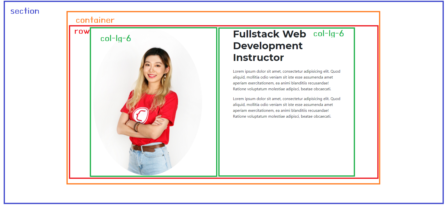 You will use the Bootstrap grid this time.
<div>
	<div class="container">
		<div class="row">
			<div class="col-lg-6 p-5">
				<img src="asset/image/bitna.JPG" class="about-img" />
			</div>
			<div class="col-lg-6 p-5">
				<h1 class="section-heading">Web Development Instructor</h1>
				<p>
					Lorem ipsum dolor sit amet, consectetur adipisicing elit. Quod aliquid, mollitia odio veniam sit iste esse assumenda amet aperiam
					exercitationem, ea animi blanditiis recusandae! Ratione voluptatum molestiae adipisci, beatae obcaecati.
				</p>
				<p>
					Lorem ipsum dolor sit amet, consectetur adipisicing elit. Quod aliquid, mollitia odio veniam sit iste esse assumenda amet aperiam
					exercitationem, ea animi blanditiis recusandae! Ratione voluptatum molestiae adipisci, beatae obcaecati.
				</p>
			</div>
		</div>
	</div>
</div>
.about-img {
	width: 100%;
	height: auto;
	border-radius: 50%;
}

.about-section {
	padding-top: 200px;
}

.section-title {
	font-family: "Montserrat";
	font-weight: 700;
	font-size: 40px;
	margin-bottom: 20px;
}
Build a Navbar Solution:
https://repl.it/@legobitna/CadetblueWindyAmoeba
Build a Hero Section Solution:
https://repl.it/@legobitna/AbsoluteTroubledKeygenerator
Today's solution: