What You'll Learn
- How to use HTML to define the structure of your page
- A few basic tags
- How to use CSS to style your page
- HTML Elements, Classes, and CSS Selectors
Today, we will learn about the heart of the web: HTML. It's the language that powers every website on the internet today. We'll start with a very simple site to teach you the basics. Warning: it will be ugly. But we'll learn how to make it look more beautiful soon.
Lecture Notes
The lecture notes can be found here: 📔 Slides
Preview of the Final Product
- Sign up for an account with repl.it (choose Student account type asked; but it doesn't matter which account type you have)
- Click new repl on the top right of screen and create a new HTML/JS/CSS project. Name your repl as
Hello World(or any name you like)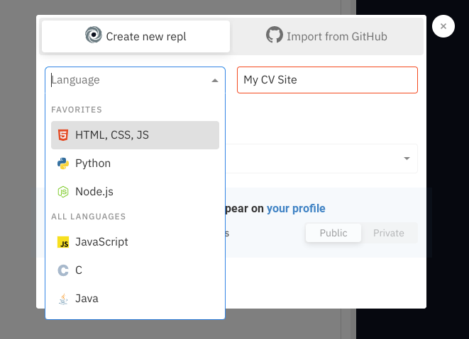
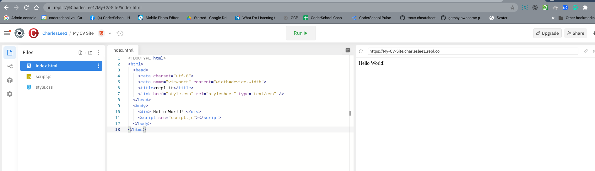
- Add
<div>Hello World</div>inside the<body>element. - Click "Run" in top center.
Final Step
You should see something like this:
View the screenshot below and practice typing the neccessary HTML code to achieve a similar page.
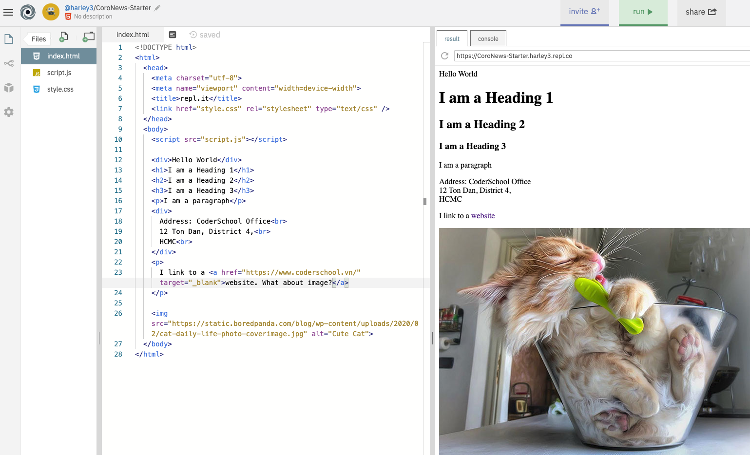
- Place the cursor inside the
<body>...</body>tags. - Insert
<h1>I am a Heading 1</h1>and hit Run. Hint: faster if you use keyboard shortcuts. PressCmd+Enteron Mac orCtrl+Enteron Windows. - Repeat inserting other HTML elements, one at a time:
h2,div,aandimg. - Notice that for links, you need an extra attribute
href="..."to set the destination. - Notice that for images, you need an extra attribute to set the image URL.
Now, let's create a new project. (You can keep the previous the old one around, just for reference.)
- Start a new repl by clicking on the new repl button, choose
HTML/CSS/JS. - Visit
index.htmland, in the same place between the<body>tags where you put Hello World! last time, insert ah1tag that has the title of your CV.
  <h1>
    My Wonderful CV
  </h1>
- Center your title, by editing the CSS. Open
style.cssin the browser to the left, and add the following lines of code.
  .text-center {
    text-align: center;
  }
- To link the CSS rule, apply the
text-centerclass to yourh1element.
  <h1 class="text-center">
      My Wonderful CV
  </h1>
Now, you can see that your text should be centered! 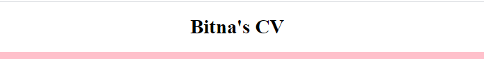
- Now, to make the font size larger, add a new class that sets the
font-sizeproperty, and add that to theh1element. You can apply multiple classes to an element, separated by a space.
  .cv-title {
    font-size: 50px;
  }
  <h1 class="text-center cv-title">
      My Wonderful CV
  </h1>
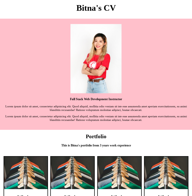
Final Result

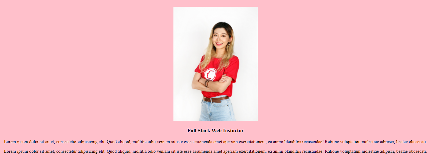
To make a simple About Me section, we have the following elements (you'll start thinking in terms of elements soon):
- An image
- A title (heading)
- Two paragraphs
You should know the tags for each. You'll want to wrap everything in a div.
<div>
    <img src="./image/bitna.JPG"/>
    <h3>Full Stack Development Instructor</h3>
    <p>Lorem ipsum dolor sit amet, consectetur adipisicing elit. Quod aliquid, mollitia odio veniam sit iste esse
            assumenda amet aperiam exercitationem, ea animi blanditiis recusandae! Ratione voluptatum molestiae
            adipisci, beatae obcaecati.</p>
    <p>Lorem ipsum dolor sit amet, consectetur adipisicing elit. Quod aliquid, mollitia odio veniam sit iste esse
            assumenda amet aperiam exercitationem, ea animi blanditiis recusandae! Ratione voluptatum molestiae
            adipisci, beatae obcaecati.</p>
</div>
Now, jump back to style.css to style your code.
- Add a background color, align text, and add some "padding" (blank spacing between elements)
  .main-section {
    background-color: pink;
  }

  .text-center {
    text-align: center;
  }
  .p-2 {
    padding: 2rem;
  }
Apply these 3 styles into that opening div.
<div class="main-section text-center p-2">
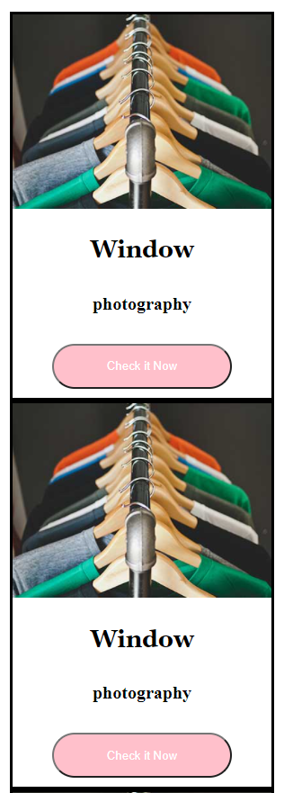
Let's create a section for portfolio cards. We'll start by creating just one, that looks like this:
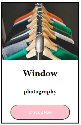
Let's break down the elements in our portfolio card.
- A black box holding everything together
- An image
- A title (heading)
- A subtitle (small heading or paragraph)
- A button
Steps
- First, create a new section, with a title.
  <div>
    <h1 class="text-center">
        Portfolio
    </h1>
    <h3 class="text-center">
        This is Bitna's portfolio from 3 years work experience
    </h3>
  </div>

- Now let's create the card.
  <div>
      <img src=" ... image url here ..."/>
      <h3>Window</h3>
      <h5>photography</h5>
      <button>Check it Now</button>
  </div>
- Nothing is the right size. Let's start defining some widths to things.
  .card {
    width: 18rem;
    border: 3px solid black;
  }
- Apply this style into the first div, so it has a width and a black border.
  <div class="card">
      <img src=" ... image url here ..."/>
      <h3>Window</h3>
      <h5>photography</h5>
      <button>Check it Now</button>
  </div>
Your image might be bursting out of the box. Let's constrain the image to fit within the box.
.img-style {
  width: 100%;
}
Now if you add this class to your img tag, your image will be constrained to 100% size of the parent's width, which is card width (18rem). Now finish making your card beautiful by adjusting font-size and text-align.
Here's the solution below.
<div class="card text-center">
    <img src="https://bitna-cv.netlify.app/asset/image/01-full.jpg" class="img-style" />
    <h3 class="title">Window</h3>
    <h5 class="sub-title">photography</h5>
    <button class="check-button">Check it Now</button>
</div>
.check-button {
  color: white;
  background-color: pink;
  width: 200px;
  height: 50px;
  border-radius: 30px;
  margin-bottom: 10px;
}
.title {
  font-size: 32px;
}
.sub-title {
  font-size: 15px;
}
For this section, we'll want to show four of those cards in a row. To do this, we'll have to dive into some more advanced concepts of CSS Layout. We'll cover them more in-depth later in the course, so don't worry. For now, we'll have you just try to follow along.
- Copy the code from the previous step so you have four cards. For now, they'll all just display one after another vertically. (This lab's goal is to make them display on the same line.)
Feel free to change the title and subtitle for each card. 😇
  <div class="card text-center">
      <img src="... your image here ..." class="img-style" />
      <h3 class="title">Window</h3>
      <h5 class="sub-title">photography</h5>
      <button class="check-button">Check it Now</button>
  </div>
  <div class="card text-center">
      <img src="... your image here ..." class="img-style" />
      <h3 class="title">Window</h3>
      <h5 class="sub-title">photography</h5>
      <button class="check-button">Check it Now</button>
  </div>
  <div class="card text-center">
      <img src="... your image here ..." class="img-style" />
      <h3 class="title">Window</h3>
      <h5 class="sub-title">photography</h5>
      <button class="check-button">Check it Now</button>
  </div>
  <div class="card text-center">
      <img src="... your image here ..." class="img-style" />
      <h3 class="title">Window</h3>
      <h5 class="sub-title">photography</h5>
      <button class="check-button">Check it Now</button>
  </div>
But now, you'll see that our cards are stacked up vertically, one on top of another, not horizontally.
- Make a new
divto hold all the cards and assign it a class, calledcards-container.
  <div class="cards-container">
    <!-- stuff from previous step, the 4 cards -->
  </div>
- Now apply the
flexproperty to thecards-container.
  .cards-container {
    display: flex;
    justify-content: space-between;
  }
Negative : ⚠️ This display: flex is a larger topic. You can read about it now on A Complete Guide to Flexbox but there's a lot to take in. In the full course, we'll go over it in more detail. For now, it's just a very quick introduction.
display: flex; by default activates something called flexbox, which aligns items horizontally by default (or, to be specific, sets flex-direction: row by default.
Now you will see your card is in horizontal alignment.
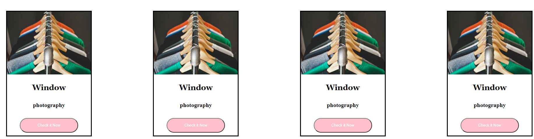
Final Product
Solution for Milestone 3
https://repl.it/@legobitna/FearlessLightyellowError
Solution for Milestone 4
https://repl.it/@legobitna/SuspiciousMemorableExams
Solution for Bonus 1
https://repl.it/@legobitna/FinishedSvelteModes
Solution for Bonus 2 & All Solution Link
https://repl.it/@legobitna/TerribleEmotionalRepo
Credits
Thanks to Bitna Kim for ideating and creating this exercise and accompanying solutions.
Thanks to Charles Lee for porting it to Codelabs format.